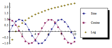
For several years now I am frustrated with how Mathematica plots look. They are sufficient to get an impression of what your data might look like, but they are as far from publication quality as a plot can get. While it is relatively easy to change how a plot looks, the PlotLegends package that comes with Mathematica is not at all nice and can virtually not be customized to give a nice legend. The default look is similar to the following example, which somehow reminds you of excel.

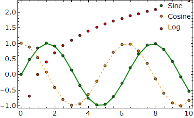
After playing around with Mathematica a bit, I came up with a code that produces the following style of plots:

The code does not do much apart from putting a Grid with plot styles and example icons above the plot. Still I consider the result a major improvement in comparison with the standard Mathematica plot legend.
You can find a copy of my code which also produces the sample plot above at my dropbox.

This work is licensed under a Creative Commons Attribution-NonCommercial-ShareAlike 3.0 Unported License.